Liam Brannigan
Blog post index
Polars 🤝 Matplotlib
Published on: 3rd November 2022
This post was created while writing my Data Analysis with Polars course. Check it out on Udemy
Polars gets on well with matplotlib.
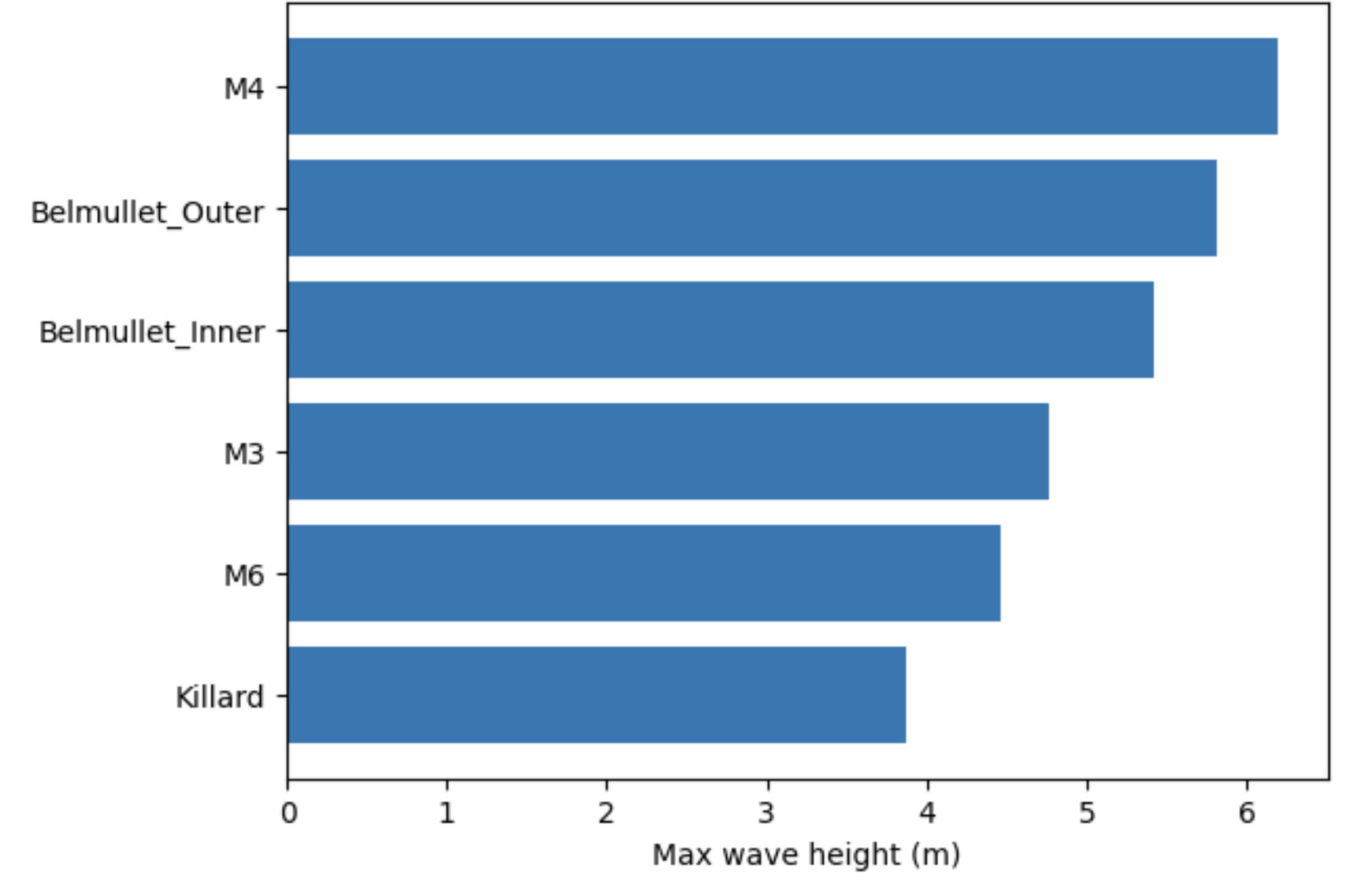
To make a bar chart for example we pass columns directly from a Polars dataframe.
In the first example below we see the maximum wave height from Irish wave buoys in the North Atlantic (this is just a snippet to give you an idea of how it works).
stationAggs = stationAggs.sort("significant_wave_height_max").tail(6)

fig, ax = plt.subplots()

ax.barh(
    y=stationAggs["stationID"],
    width=stationAggs["significant_wave_height_max"],
)
ax.set_xlabel('Max wave height (m)')

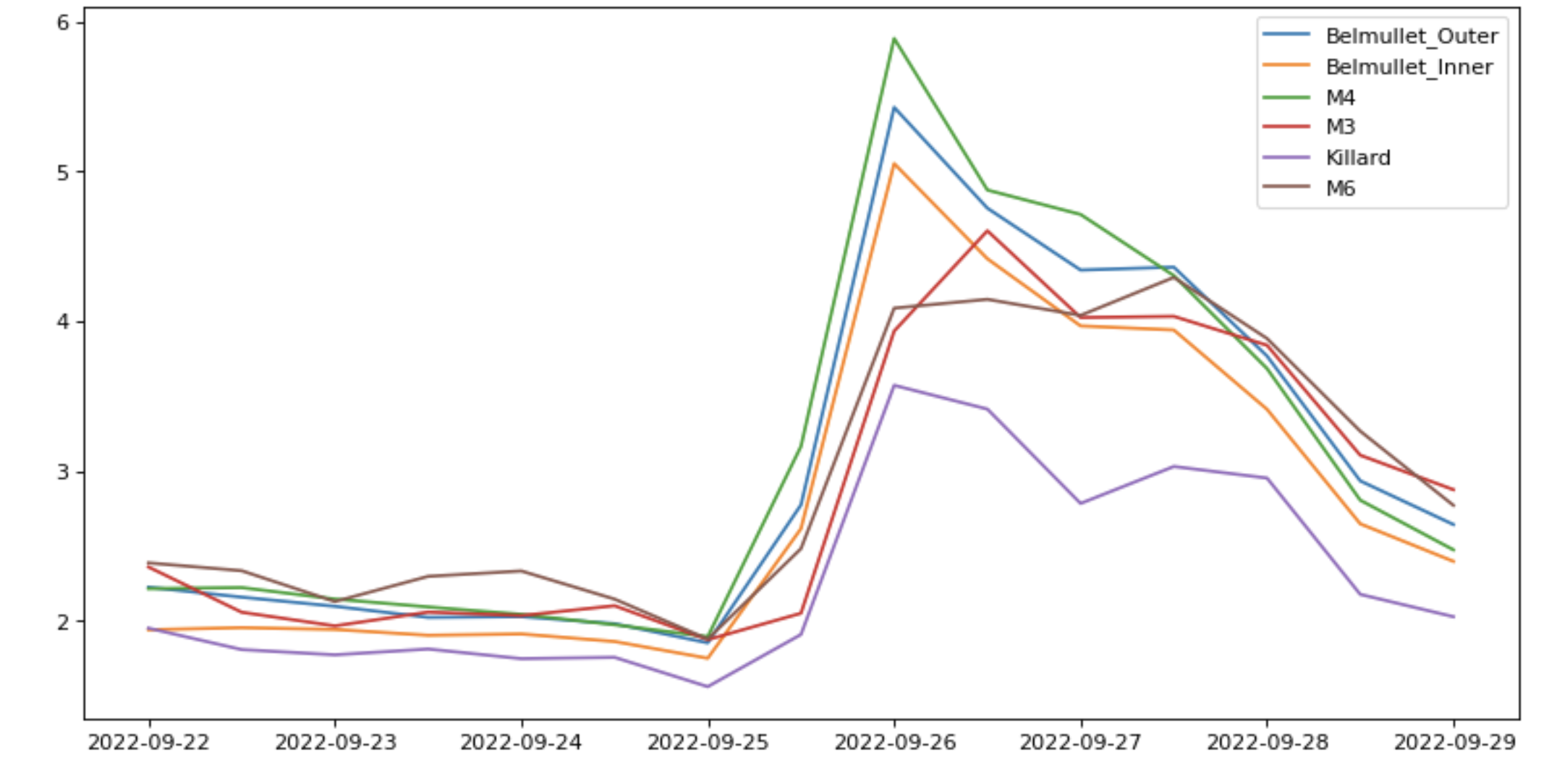
Can we do some storm-tracking as well?
In the second example we take 3 hour averages of the wave height for each station with the fast groupby_dynamic method.
To do multi-line plots we need to call the ax.plot method for each line. When can do this by looping through a groupby object to get the data for each station and see a storm with some chunky waves arriving on 26th September.
# Average time series for each station into 3 hour windows
averagedValuesDf = (
    dfBigWaves
    .groupby_dynamic("time","3h",by="stationID")
     .agg(
            pl.col("significant_wave_height").mean()
        )
)
fig,ax = plt.subplots(figsize=(12, 4), dpi=80)
# Loop through the groupby to get the values for each station
for stationDf in averagedValuesDf.groupby("stationID"):
    stationID = stationDf[0,0]
    # Add a line for each station
    ax.plot(
        stationDf["time"],
        stationDf["significant_wave_height"],
        label=stationID
)
plt.legend()

Learn more
Want to know more about Polars for high performance data science and ML? Then you can:
- join my Polars course on Udemy
- follow me on twitter
- connect with me at linkedin
- check out my youtube videos
or let me know if you would like a Polars workshop for your organisation.